


Beauty · United Kingdom · Identity
HALIMAH & FIRTH
Brand development
Sector
Beauty
Location
United Kingdom
Scope
Brand Identity · Colour Direction · Brand Applications
Status
Ongoing
The Project
A house built on restraint.
A mark bold enough to hold it.
"In beauty, restraint is the boldest position a brand can take."
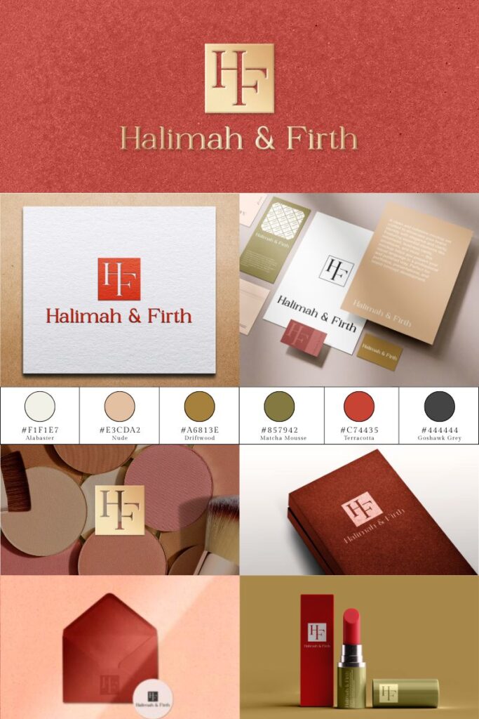
Halimah & Firth arrived with a clear conviction: in a category that shouts, elegance lowers its voice. The identity had to carry that philosophy in a single gesture, and the brand's Indian heritage with it. The monogram does the work, two letterforms interlocked with the precision of a clasp. The palette holds the culture: terracotta drawn from clay and spice, gold from ceremony, nude and driftwood from skin and earth. Heritage carried as pigment, not ornament. A system built to hold its own on a compact, a carton or a storefront.
The Work
Three phases
-
01
Brand Identity
A monogram-led identity built on one interlocking gesture. Designed to carry the brand alone, from gold-foiled packaging to a favicon.
-
02
Colour Direction
A palette rooted in the brand's Indian origins: clay, spice, ceremony gold. Terracotta as the signature, with the neutrals doing the quiet work around it.
-
03
Brand Applications
Packaging, stationery and print, engineered for consistency at every scale. The system stays legible whether embossed in gold or printed at ten millimetres.